
Case Study
The Daylight Packaging System
Retail packaging for the full lighting range at The Daylight Company — more than twenty packs across consumer lamps, magnifiers and portables. Every one is built from the same set of parts: an s-curve, a line drawing, a studio photograph, an icon set and a specification block. This is what those parts are, why each one exists, and how they were made.
The Brief
Stand out on a shelf you don’t control
Daylight lamps are bought for their light quality, and light quality is invisible in a shop. The packaging had to make a technical argument legible from two metres away, then repeat it across more than twenty products without turning into twenty different boxes. It also had to do something harder. The range led its market and had been imitated for years, so the design needed to separate the original from the copies — not simply look tidy on a shelf.
Client
The Daylight Company
My role
Design, photography, artwork
Scale
20+ retail packs
Markets
EN · DE · FR · ES · NL · JP · US
Breaking it down
The Elements
Six components carry the whole range. Each one was drawn, shot or built once, then applied across every pack.
Graphic Element
The S-Curve
The device that holds the whole system together. Developed with the Product Design team and drawn from the silhouette of the Slimline — the best-selling lamp in the range — so the shape already carried recognition before it was ever a graphic.
It splits every pack into a black field and a white field. The black side carries the product photograph and the product name; the white side holds the logo, the claims and the specification. High contrast, no decoration, and a shape a customer starts recognising from across the aisle.
It did not stay on the packaging. The same split runs through every touchpoint the brand puts in front of a customer — fact sheets, catalogues, adverts, point of sale, digital. The examples alongside are a few of them.
Technical Drawing
Technical Line Drawings
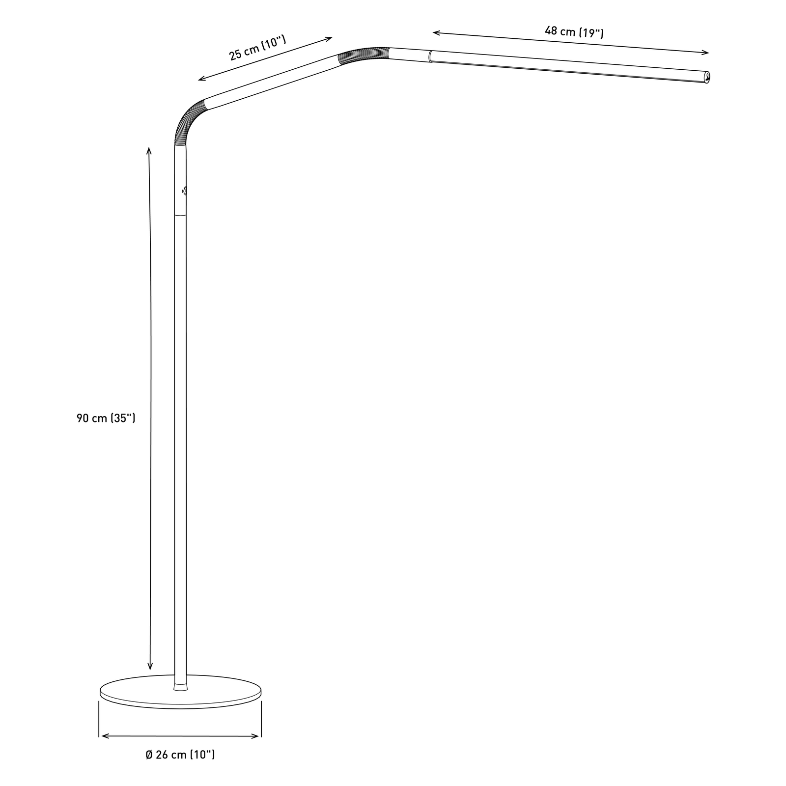
Every product was drawn as dimensioned line art so a buyer can judge reach, height and footprint before opening the box. Around eighty drawings across the catalogue.
Each one was produced in two versions, white and black, so the same drawing works on a dark pack panel, on a white website page, and in any other material the company needed it for. Drawn once, used everywhere — which is the difference between an illustration and an asset.
Photography
Product Photography
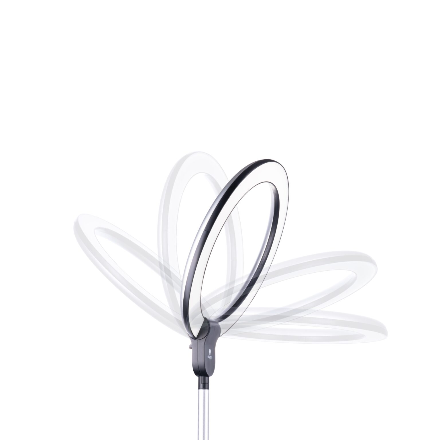
New photography was produced for the front of every pack, shot inside The Daylight Company’s own studio. Lighting a lamp that emits its own light is the hard part — hold the ring or the shade without blowing it out, and keep a black chassis readable against a dark field.
Each shot was planned with the Product Design Director and the product team so the photograph actually demonstrated the features being claimed, rather than just showing the object. The sales team fed in what customers ask about most, and those answers decided the angle.
Iconography
The Icon Set
One icon language across the range: light quality, ergonomics and design as benefit marks on the front, plus technical icons for lumens, lux, life hours and energy consumption on the side panel.
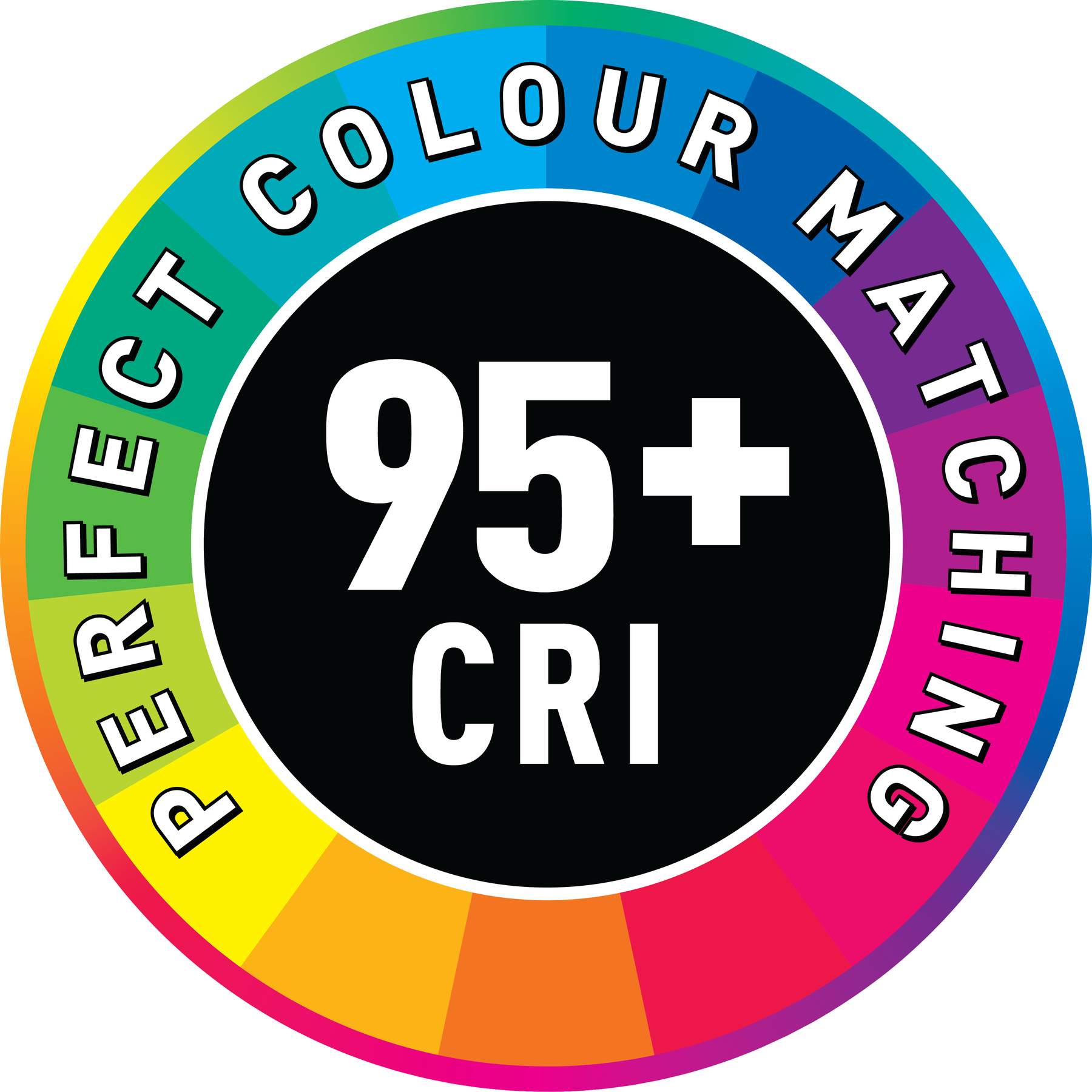
The 95+ CRI mark was drawn specifically to separate the premium lamps from the rest of the range and from anything else on the shelf. Colour rendering is the strongest thing these lamps do and the hardest to photograph, so it needed a mark that states it outright.
Information Graphic
The Daylight Simulation Scale
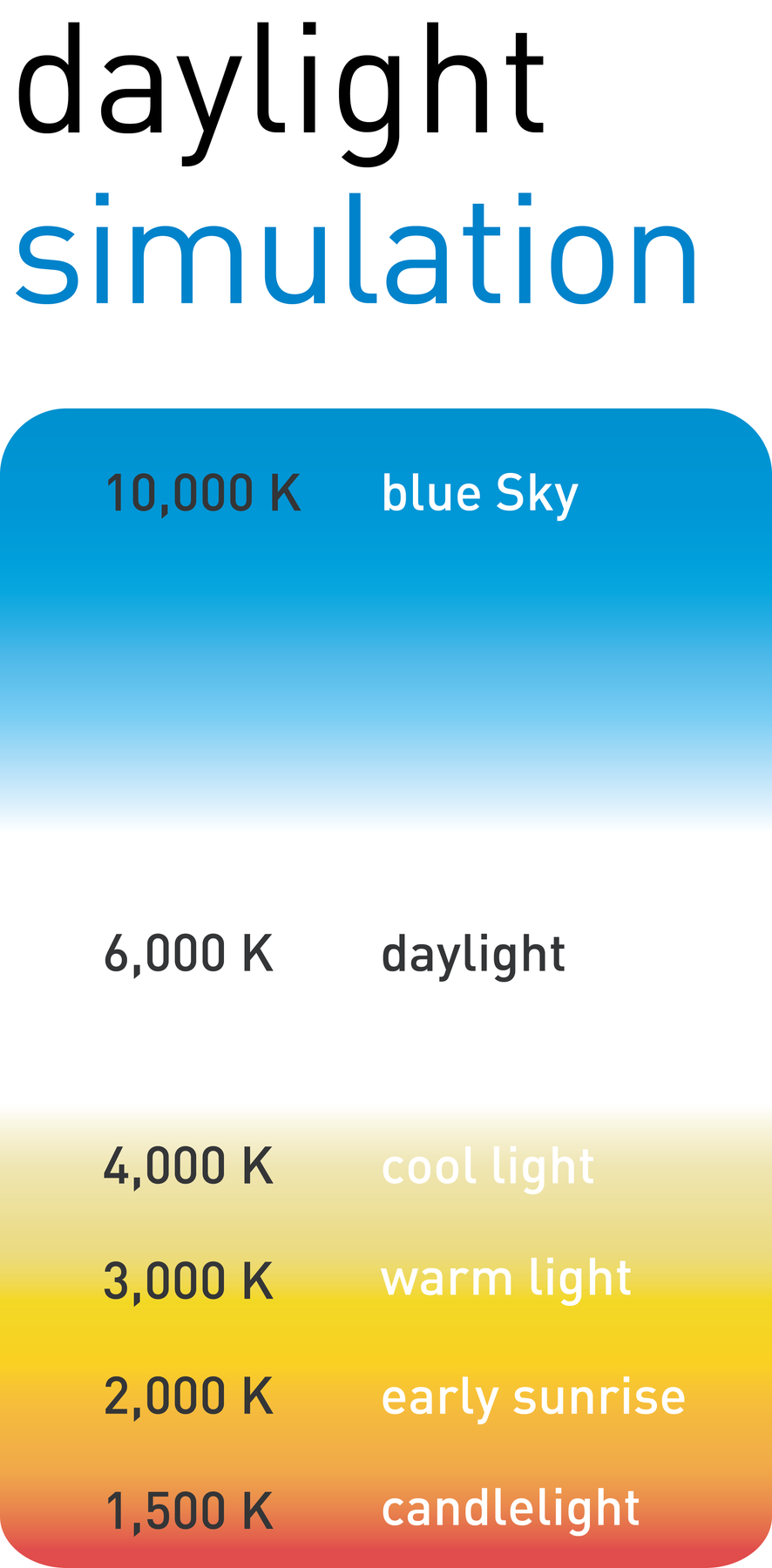
A colour temperature scale running from candlelight through to blue sky, with the product’s own output marked on it. It turns an abstract number — 6,000°K — into something a customer can place against light they already know.
Same scale, same position, every pack. Once someone has read it on one box they can read it on all of them.
Specification & Localisation
Specification & Market Variants
The full specification in five languages — English, German, French, Spanish and Dutch — at ten feature points each, alongside the energy label, barcode, recycling marks and certification stamps.
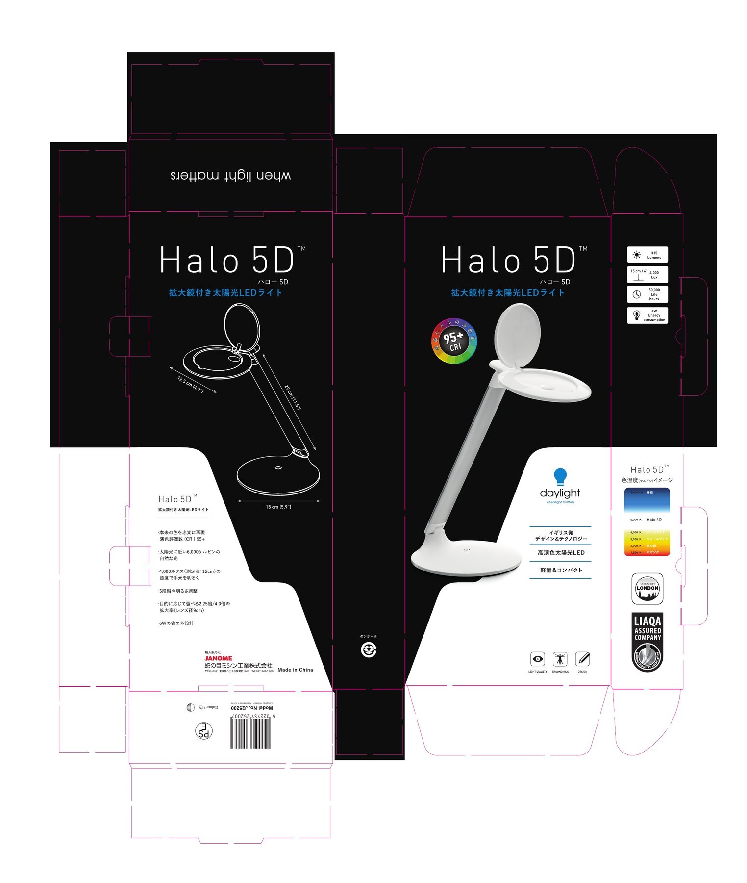
Beyond those five, the range shipped to the US, and a run of packs was rebuilt in Japanese for JANOME — product names set in katakana, the specification localised and the 95+ CRI badge redrawn with Japanese around the ring. Each new territory meant another language and another set of compliance marks, so the panel was designed to stretch rather than be rebuilt: adding a market became a layout change, not a redesign.
How it was made
Built around the product
None of this was produced at arm’s length. I worked directly with the Product Design Director and the product team to understand what each lamp actually does — the optics, the mechanism, the tolerances — and with the sales team to learn which of those features people ask about before they buy.
The s-curve came out of those conversations rather than a moodboard. So did the decision to lead with CRI. Knowing the product properly is what let the packaging make a technical argument in four lines instead of a paragraph.
Result
What changed on the shelf
The Daylight Company led its market, and that had become the problem. Smaller brands had spent years copying the look, until the shelf filled with packs close enough to ours that customers stopped telling them apart. A premium product was blending into its own imitators.
So the redesign rebuilt the system rather than restyling a box. Packaging first, then the technical leaflets and the digital material in the same visual language, so every surface a customer meets carries the same signals and the information that decides a purchase sits where they expect it.
The range reads as clearly premium again, and holds its brand position instead of defending it. Retailers went on to give Daylight its own dedicated sections in bricks-and-mortar stores, and sales rose across all markets.
Applied
One system, the whole range
Every pack below was mine end to end — concept and planning, studio photography, layout, typography and colour, the icon and graphic system, and the print-ready artwork signed off for print. The same six elements rearranged for portrait, landscape and wide cartons, across consumer lamps, magnifiers and portables.